
When Your Colours Just Aren’t... there.
- Aug 10, 2025
- 1 min read
You’ve got your brand, your fonts, your layout... and then you look at the colours and something just feels off.
We’ve all been there. It’s important to choose colors that not only look visually appealing but also make sense with the brand you’re building. Colour sets the tone—literally.
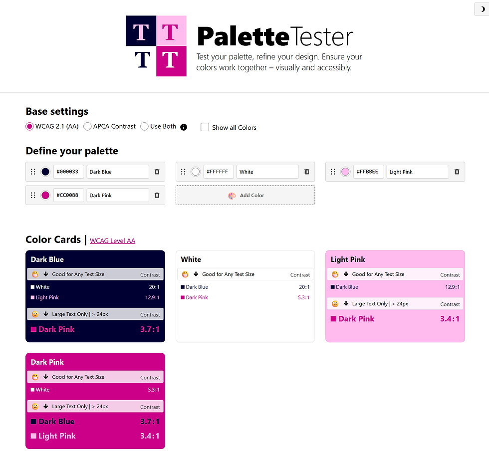
Sometimes, despite your best efforts, the palette just isn’t sitting right. That’s when I stumbled across a handy tool that made the whole process easier:
Why It’s Great
You can plug in all your hex codes and see how your palette actually looks together in real-time. No guessing, no opening 17 tabs in Illustrator just to compare swatches. Just enter your colors and shift things around until they feel right.
Use it to:
Test background + text color contrast
Play with hierarchy
Check colour harmony
Catch weird clashes before finalizing
Pro Tip: Combine With the Colour Wheel
Once you’ve got your colors in the tester, refer back to your colour wheel. Are you sticking with complementary? Going for a monochromatic vibe? Is your accent color stealing the whole show?
Use this tool with the client and the color wheel to make choices that are not only pretty—but purposeful.
If color theory stresses you out or you just need a fresh pair of digital eyes, this tool is the equivalent of a stylish friend who’s brutally honest but wants you to win.
Try it out, tweak your hexes, and let your palette pop.
Comments